Pages

Monday 29 February 2016

Catwalk/ My Key Colours

 Blush Pink (Pantone 14-1311): A colour similar to this Rose Quartz (Pantone 13-1520) was seen on the catwalks this Spring & Summer, however I felt it was a bit too bright in contrast to the monochromatic colour palette of Givenchy's Ready To Wear collection so searched for a more toned down alternative. Blush Pink is a muted, nude pink which I think works well with the ethereal feel of this collection yet brings some colour to the otherwise neutral palette. I love this colour with pearly whites and as pearls are a main focus of my design thought this would pair perfectly. I am planning to incorporate this colour into the make up, as well as the clothing my models are wearings. 


Antique Gold (Pantone 16-0730): The embellishments seen in my catwalk designs will be gold, inspired by the golden embellished masks created by Pat Mcgrath for Givenchy's S/S16 collection. The combination of pearl and gold feels very ethereal which is exactly what I am going for with my designs. The gold will be seen in both the accessories and also in the make up, through the pale gold highlight giving a metallic sheen to the face. 


Pearled Ivory (Pantone 11-0907): This colour is closest to the shade of pearls I will be using in my design. This colour will also be represented in the make up, I plan to use a very pale, pearlescent highlight all over my models face so that the skin takes on the texture of a pearl. 

Catwalk / Symbolism of Pearls & Gold


Both Pearls and Gold are a play huge part in Givenchy's S/S16 collection and also have heavily inspired my looks for this project. They are both historically very symbolic and carry various associations.  


Pearls

Dating as far back as Ancient Greece, Pearls have been seen as a symbol of royalty, wisdom, higher spirit, beauty and femininity. I wanted to create a ethereal, elegant design for the catwalk show, so looked into the symbolism of the Pearl and found their meaning fitted perfectly with what I wanted to create. Royalty and higher spirit really link in with the glowing, feminine goddess like look I have designed. The greeks believed the pearl would promote marital harmony and I imagine this would have been one of the inspirations behind using pearls in Givenchy's S/S16 collection, as Riccardo Tisci says on multiple occasions that the collection was heavily bridal inspired. Due to their associations with the gods and royalty, Pearls give an expensive look to garments and have long been associated with class. A simple string of pearls is one of the trademarks of classic icons such a Audrey Hepburn and is said to never go out of style. 


Gold

Golds main symbolism is of wealth, as it always has been. Other associations are with the gods, the church, affluence, extravagance, sophistication and elegance. It is for these reasons why the metal has always been popular among celebrities and royals. Gold is used as a display of wealth among celebrities frequently with their gold watches, cars and even teeth. I like the way both Gold and Pearls carry similar symbolisms making them the perfect pairing for embellishments in my designs. 


lacquertude (2013) PiCture pOlish Tiffany: Swatch & review. Available at: http://lacquertude.com/2013/11/10/picture-polish-tiffany-swatch-review/ (Accessed: 24 April 2016).
Edit reference
Hubs, 21 Followers 90 (2014) The meanings and myths of pearls. Available at: https://bellatory.com/fashion-accessories/pearl-myth (Accessed: 24 April 2016).
Jacob (2014) Gold color meaning - the color gold. Available at: http://www.color-meanings.com/gold-color-meaning-the-color-gold/ (Accessed: 24 April 2016).
Gold car archives - (no date) Available at: http://www.newcarselloff.com/content/tags/gold-car/ (Accessed: 24 April 2016).

Sunday 28 February 2016

Trend / Braids

Braids were a huge trend this Spring/Summer so as they will feature in at least one of my looks, I have explored the different types of braid to narrow down which I may use for one of my designs. 


These twist braids, seen at Altuzarra offer a slightly boho take on the half up half down trend. They are a good way to create a more interesting hairstyle with minimal time, so could be perfect for a catwalk look. If I was to do a half up half down style like this, I would probably include a hair accessory to add interest to the style and to keep in line with Givenchy's typically very embellished catwalk designs. 


This double french braided style on the left was seen at Giles and offers a sports luxe feel, while Céline showcased sleek plaited ponytails, something I may incorporate into one of my catwalk designs. 


I love these halo plaits seen at Hervé Léger, I think the look they create is very soft and springlike but the way they follow the line of the parting on an angle instead of following the hairline makes them unique. I think this style could look lovely on a blonde model for my daytime advertising design, but possibly with a fishtail braid for a even more unique twist. 


Kula, M. (2006) HOW-TO: NYFW SS16 HERVÉ LÉGER X ORLANDO PITA BRAIDED CROWN PONY. Available at: http://maneaddicts.com/2015/09/14/orlando-pita-braided-crown-pony/ (Accessed: 1 April 2016).
Edit reference
Something (2015) SS16 hair trend: Braids & twists. Available at: http://somethingaboutmagazine.com/ss16-hair-trend-braids-twists/ (Accessed: 1 April 2016).
Edit reference

Trend / Dewy Skin


Luminous, glowing skin is a sign of health and youth, as in old age the skin looses its natural plumpness and moisture and begins to look dull and wrinkled. The dewy skin trend is seen frequently in both advertising, editorial and catwalk make up and can be used in different intensities to create anything from a desirably glowing finish, to a editorial style shot where the model is dripping with product. 


Dewy skin wasn't always seen in this way, with the last century favouring flawless, matte and powdered complexions as a standard of beauty at the time. Glowing complexions go in and out of high fashion, often being favoured in the Summer months, however always have a place in the advertising and editorial world where they are used to make a statement or demonstrate a pretty, youthful look which helps to sell a product (e.g foundation/concealer/bronzer). The dewy look can be created using a huge variety of products, a powder highlight to create a pearlescent sheen, or a liquid mixed in with the base to create an all over glowing finish. 


This Becca Illuminator advert features a model looking radiant and healthy, with flawless smooth skin that perfectly reflects the light. She looks awake, fresh, and glowing - showing the apparent results of choosing that product. Advertising make up is usually more toned down and wearable as the look needs to appeal to the everyday consumer, featuring wearable, desirable make up that a consumer feels they can use in a day to day situation. For this reason the dewy skin in my advertisement looks will be more toned down and naturally radiant than noticeably dewy. 


These above looks show how extreme the glossy look can be taken when used in an editorial setting. I love the wet finish of these looks, I think this creates a really ethereal, pearlescent finish which fits perfectly with the ideas  for my Givenchy designs. I want the make up to reflect my design inspirations, one of which is the use of pearls so incredibly highlighted skin will pay a huge part across all of my six looks I create for the brand. As my catwalk & editorial looks are both particularity inspired by pearls, I will be looking to achieve an effect similar to the one seen in the top right image, as the highlight as highly reflective but also lightly golden like a pearl. 


On the catwalk this season 'gym skin' was seen across numerous brands. This natural, luminous, fresh faced look was often seen paired with light freckles (another of my key trends) and the overall look is undone and healthy - perfectly offsetting any heavier make up used like a dark lip or hollowed eye socket. Obviously, as catwalk make up has to be durable enough to withstand the show, the look can't be pushed too far as any product too wet would just slip off the face, so this is something I will think about when creating my catwalk design and will experiment with layering cream and powder products to create the look I am after. 

Top beauty fashion photographers-celebrity editorials vogue advertising professional commercial: Stylist magazine complexion beauty editorial with Gucci Westman makeup artist, Marcelina Sowa model (no date) Available at: http://jamienelsonphoto.blogspot.co.uk/2015/08/stylist-magazine-complexion-beauty.html?view=timeslide (Accessed: 15 April 2016).
Hearts, S. (no date) AD - SKIN. Available at: https://uk.pinterest.com/pin/190488259214334362/ (Accessed: 15 April 2016).
BECCA | shimmering skin Perfector® pressed(no date) Available at: https://www.beccacosmetics.com/shimmering-skin-perfector-pressed-2eeec7.html (Accessed: 15 April 2016).
Dewy skin (no date) Available at: https://uk.pinterest.com/explore/dewy-skin/ (Accessed: 15 April 2016).
Edit reference

Catwalk / Mood Boarding


This board focuses on the general mood inspiration of my Givenchy catwalk designs. I started by looking at what that brand had chosen for the actual S/S16 show and the colours and textures they used. To find the key colours for my look I researched colours that were are in this Spring & Summer and decided that a dusky, blush pink would work perfectly with the ethereal lace textures seen at the show. The pink would bring a slight warmth to the look, helping bring a springlike touch to offset the monochromatic ready to wear collection Givenchy released this season. I looked up the Pantone name of the pink I wanted to make sure I was always referencing the same colour. The shade seen at NYFW was Rose Quartz (Pantone 13-1520), but I decided this was too pastel for the look I am going for so looked for a more muted version and found Blush Pink (Pantone 14-1311). The lace textures and pearl embellishments included on this board are the other main inspirations for the look I am hoping to create as well as the sheeny texture seen in the image of the eye. 


This board focuses on my inspirations for the hair and make up for my catwalk design. Various plaits were seen everywhere on the S/S16 catwalks and this is something I would like to feature in one of my looks, so the above picture is just an example of one possible plait design. For my second catwalk look, I love the circular hair accessories seen at Céline - I think they work well with the 'pun' seen here but might look softer with a centre parted, half up half down style. I am hoping to create incredibly dewy, ethereal skin using a white gold highlight to give an angelic look to my model, to offset the pearl embellishment on the lids. I like the brightness of the inner corners in the look seen above and will experiment with this being a part of my design. 

Catwalk / My concept and inspiration

An example of the contrast between the delicate lace and industrial setting at the S/S16 show
When thinking about which direction I would like my Givenchy catwalk designs for I took inspiration from their S/S16 Ready to Wear collection, as well as the multiple different looks Pat McGrath designed for the show. I am also inspired by the setting of the show and how the minimal, industrial surroundings offset the delicate monochromatic lace and silk pieces.

 Givenchy typically showcase multiple looks on their catwalk shows, one more pared back and others wonderfully avant garde and extravagant. I want to show both sides of the brand within my two designs, while ensuring they link and flow together, drawing inspiration from the same colours and textures as well as making sure they would fit well with Givenchy's S/S16 collection. Some key words I would use to describe the brands designs this season would be: Ethereal, delicate and embellished. I'd like my designs to be a new take, yet to still reflect these key words.

Design #1: Reflecting Givenchy's more avant garde side, this pearl design is heavily inspired by one of Pat Mcgrath's designs for the brand this season. However, I want to take a more pared down approach concentrate the pearls on just the eye area, while maintaining a focus on dewy skin (one of this seasons trends that will be key to all my designs). I want to create a base that has an almost pearl like sheen, using a pale gold highlight to give the effect of glowing, goddess like skin. To keep a softness and femininity to the face, the brows will not be bleached, however I will lighten them with an ashy shade to keep the focus on the eye embellishment. Reflecting the gold tones seen in embellishments at Givenchy's S/S16 show and taking inspiration from the circular hair embellishments seen at Céline. The lips will be a neutral blush pink shade to compliment the femininity of the pearl design.

Design #2: Linking to the other design through the heavily pearlescent finish of the skin, this toned down Spring look focuses on one of the key colours I want to incorporate into my designs, a blush pink. The shade will be seen on both the eyes, lips & cheeks, reflecting the tones seen in the clothing I will have my models wearing. This is a very simple pared back look to compliment my first design, however this second design will have more of a focus on hair. Braids were a huge trend this S/S16 with a huge variety of styles seen at fashion week. I want my models hair to be sleek and off their face and love the design of the two strand twisted braids seen at Céline.

Hybrid beauty: Of jewelled faces and masks(2016) Available at: http://www.webelieveinbeauty.com/belleza-wwbb/cat-belleza/981-hybrid-beauty-of-jewelled-faces-and-masks.html (Accessed: 16 April 2016).

Friday 26 February 2016

Catwalk / Previous Spring/Summer Looks

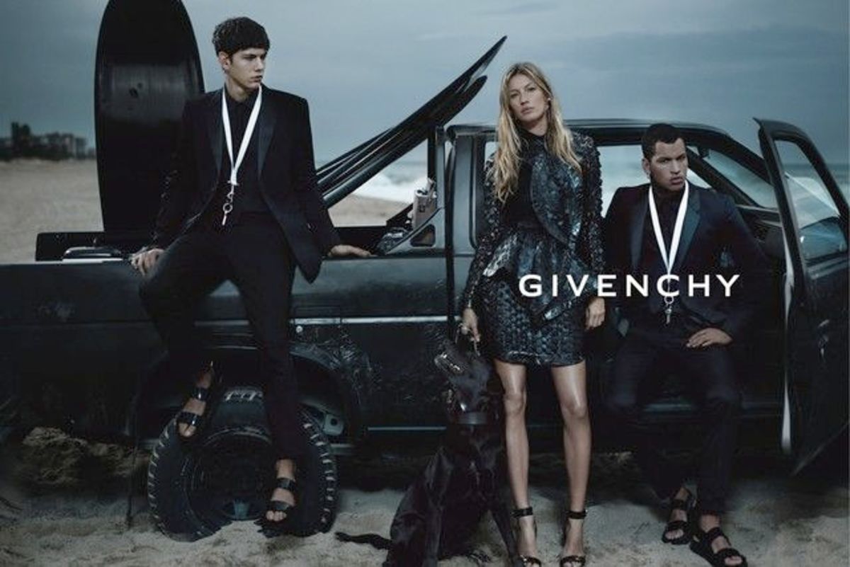
S/S12 - This glowy, Summery look is seen here on Gisele Budchen, who was one of the biggest supermodels at the time. Compared the the looks Givenchy has featured at their Spring/Summer shows since, this look is quite fresh and Summer inspired with tanned, freckled skin, natrual definition in the eyes and a rosy pink on the lips. It is less harsh and more youthful than Givenchy's recent style, especially when combined with the tousled, beachy waves of the hair. The look is given an edge by the dot of colour in the centre of the lower lash line which almost hints at a tribal feel for the look, the placement reminding me of the face painting seen among many tribes across the world.
S/S13 - Very different from the previous years look, this pale, almost Sci-Fi inspired look was paired with a fairly monochromatic clothing collection. The overall look is quite harsh with the scraped back hair, pale skin, sunken eyes and bleached out brows. The glossy, peachy nude lips bring a sight femininity to an otherwise very androgynous look.


S/S14 - Created by Pat McGrath, these sequinned and jewelled masks were seen in an array of colours on the SS14 catwalk. The collection itself was very colourful using block prints and the mask colours were all complimentary to the clothes. In contrast to the previous years minimal look, this make up makes a serious statement in its own right, not just complimentary to the clothing collection.


S/S15 - Seen here on Kendall Jenner, last Summers look was again created by Pat McGrath. I can see this look clearly references that of S/S13, featuring bleached brows, a rosy lip and a sunken winged out eye shape. However this adaptation is far softer due to the loose, centre parted hair, tanned dewy skin and bronze shadow. The lips also have a more balmy pink hue which brings freshness and life to the make up. The result of this is the look has a far more Summery feel, paired with a monochromatic yet printed clothing collection.

S/S16 - For this years collection, Pat Mcgrath created multiple looks, one of which was this stunning face lace. A symmetrical pearl design was layered with net to create a soft, ethereal look that reminds me in pattern of Mexican sugar skulls. Balanced with almost no make up on the eyes and lids, the ears are also a feature with heavy embellishments. Slightly like the sequinned masks McGrath created for 2014, each lace design was slightly different using different textures and embellishments. The lace used picked up on accents in the clothing collection to ensure the models looked in symmetry with the designs they were wearing.


S/S16 - The models not wearing the lace wore this more pared down, slightly grungy look. It fits well with the pretty vs tough crossover seen in this collection, the monochrome lacy garments paired with grungy accents. Again, I feel this look references both S/S15 and S/S13's collections, the combination of bleached brows and a sunken brown eye with a natural lip seems to be a go to look for the brand although it has been adapted differently every time. Just two models also wore a dark berry lip with this look, a pop of colour that worked perfectly with the monochromatic tones.

Shopper, T.B. (2012) GIVENCHY SS12 MAKEUP. Available at: http://fixmakeup.co.uk/2012/07/06/givenchy-ss12-makeup/ (Accessed: 25 March 2016).
Shopper, T.B. (2013) GIVENCHY SS13 MAKEUP. Available at: http://fixmakeup.co.uk/2013/02/08/givenchy-ss13-makeup/ (Accessed: 25 March 2016).
Magazine, G. (2016) Behold: The most stunning spring ’14 looks created by makeup artist Pat McGrath. Available at: http://www.glamour.com/lipstick/blogs/girls-in-the-beauty-department/2013/10/behold-makeup-artist-pat-mcgra (Accessed: 25 March 2016).
Clough, A. (2015) Every beauty look you need to see from NYFW. Available at: http://www.mimichatter.com/nyfw-spring-summer-2016-best-beauty-looks-1341435637.html (Accessed: 25 March 2016).

Edit reference

Thursday 25 February 2016

Initial Mood Board

This is my initial mood board for the project, showing some images from Givenchy's S/S16 show and giving an idea of the colour palette and textures I want to include in my designs.

Wednesday 24 February 2016

Givenchy and the Avant Garde


Avant Garde means new and experimental ideas in art, music or literature. It is a phrase commonly used to describe creative, artistic make up that pushes the boundaries of the normal feature perfecting style of application and turns it into an art form in its own right. Pat Mcgrath, who has been named most influential make up artist by Vogue, has worked with Givenchy on the make up for their shows over the last three years and there has been a noticeable change in the style of the make up.


Examples of Dior's Haute Couture Catwalk Looks
Prior to 2014, Givenchy's ready to wear make up looks were fairly natural and minimal but from 2014 onwards Riccardo Tisci clearly decided to push the normal boundaries of his shows and celebrate artistic and avant garde make up. Clearly inspired by the Avant Garde catwalk looks seen at the likes of Dior, Pat Mcgrath has designed the make up for the shows since 2014 and says she takes inspiration from the fabrics and garmetns when creating the designs. The images below show some of the images she has created for the brand.


Jewels and embellishments seem to be key for her make up style and this 'masked' idea is one she has repeated multiple times when working with Givenchy, changing up the materials, patterns and placement. The designs she created for S/S16 have a slight strangeness to them, which she says in an interview is what Riccardo Tisci wanted from the looks. Avant Garde make up really pushes make up as an art form and shows it is so much more than just the everyday application used to define features. 

Fatale, M.B. (2016) Beauty inspiration: Makeup at haute couture shows. Available at: http://www.makeup4all.com/beauty-inspiration-makeup-at-haute-couture-shows/ (Accessed: 24 April 2016).
http://www.vogue.com/867197/the-beauty-report-givenchys-jeweled-tribal-face-masks/
G, L. (2016) 2015’s greatest makeup moments!. Available at: http://mascarawars.com/2015-makeup-moments/ (Accessed: 25 April 2016).
Young, K. (2015) Fierce face lace at Givenchy SS16. Available at: http://www.telegraph.co.uk/beauty/make-up/beauty-Givenchy-SS16/ (Accessed: 25 April 2016).
Edit reference

Tuesday 23 February 2016

Givenchy's Use of Colour

When researching my brand for this project, I spent a lot of time thinking about Givenchy's use of colour and how I could reflect this through my own designs to help keep them in line with something the brand would actually produce. 


As can see from all these images, I noticed that Givenchy's colour palette is very monochromatic and predominantly cool toned. If warmer tones are used they are usually used in a very muted way and you rarely see bright, garish colours. I think as cool tones look slightly harsher and more washed out, this gives all the images the brand produces a very stark, minimal and edgy feel to them which reflects the designs well. 


I love the use of colour in this image above, this is not the only example of how Givenchy use stark, industrial, cool toned backgrounds to tone down a look. I like how the only pop of colour is the icy cornflower blue shown under the black lace dress. Black lace is a very signature style for the brand and is repeated across frequent editorials and catwalk collections. 


These images here are great examples of how Givenchy uses colour in a muted way. Cool toned greyish blue is a colour seen frequently from the brand, wether it is used as the backdrop colour in a studio, in the clothing or as part of the general setting and tone of the image as seen below. 


Givenchy frequently shoot their editorials in black and white, choosing to focus on embellishment, fabric texture and tone instead of colour. This gives a distinct edge to their imagery and makes their editorials recognisable.


I love the use of colour in this image and how it is almost un saturated yet the colour of the skin still has a slight warmth. The tones here remind me of the pearls used in their S/S1y show and the luminescence of the skin reflects that of the clothing and colouring of a pearl. 


Even their beauty ad campaigns have this cool tinge to them. You can see this dark, moody blue is used again here and this is the colour that has been picked out of this collection to focus on, even though the collection features pastel blues and a bright coral lip colour. 


Home (2015) Campaigns. Available at: http://www.thefashionisto.com/filip-hrivnak-simon-miskech-model-givenchy-for-one-cover-shoot/ (Accessed: 23 April 2016).
MagdaLena (2012) Fashion focus: Givenchy nose ring. Available at: https://edelscope.com/2012/05/21/fashion-focus-givenchy-nose-ring/ (Accessed: 23 April 2016).
Estate, S. (no date) Givenchy. Available at: https://in.pinterest.com/pin/313492824033828965/ (Accessed: 23 April 2016).
MODELWERK BLOG (2016) Available at: http://modelwerk1.rssing.com/chan-11916824/all_p14.html (Accessed: 23 April 2016).
explorergram (2016) Givenchy editorials: @lilyaldridge in Givenchy by @riccardotisci17 spring summer 2016 in @wmag | explore instagram online – ExploreGram. Available at: http://exploregram.com/givenchy-editorials-lilyaldridge-in-givenchy-by-riccardotisci17-spring-summer-2016-in-wmag/ (Accessed: 23 April 2016).
Givenchyofficial GIVENCHY (2016) Available at: http://www.alamode.news/user/givenchyofficial (Accessed: 23 April 2016).
(no date) Available at: http://fashionista.com/2014/01/givenchy-spring-2014-ad-campaign-erykah-badu (Accessed: 23 April 2016).
Mariacarla Boscono for Givenchy makeup collection ad campaign (no date) Available at: https://uk.pinterest.com/pin/424253227374315060/ (Accessed: 23 April 2016).
tess (2010) Team Peter Stigter video. Available at: http://www.teampeterstigter.com/paris/givenchy-catwalk-fashion-show-paris-ss2011/ (Accessed: 23 April 2016)
Edit reference
Edit reference
Edit reference
Edit reference
Edit reference
Edit reference

Monday 22 February 2016

Givenchy Counter


I wanted to try out the products I would be advertising to help me design a look and get a feel for the textures and how the products worked on the skin. I visited the Givenchy counter in Bournemouth, but unfortunately they had already sold out of their Spring La Revalation Originelle Collection that I am basing my daytime shoot around and no longer had any at the counter I could try.  Unfortunately I have already planned my day look, otherwise I would have chosen products from a collection I knew I would be able to get a feel for. However I tried out several of their other products, to help me decide what to focus my evening advertisement on.

I loved the formula of the Ombre Couture Cream Eye Shadow, in the shades #7 (Charcoal Grey) and #N19 (Graphic Bronze). Both of these shades had lovely creamy, pigmented formulas that were blend able yet set down and lasted for hours on my hand. I thought one of these shades would be great to use for my evening ad campaign as both fit in with the other colours I am using in this project, as well as being dramatic enough for use in the evening.

I also tried out the new Blush Memoire Le Forme's from their new Summer collection. These liquid/gel blushes feel like water on the skin. I loved the formula of these blushes, the light texture is perfect for Summer and blends into the skin to look like a natural flush. Even though the colours are bright, they don't look too intense when applied due to their sheer formula.

Another product I am considering for my evening ad look is their Rouge Interdit Vinyl Lipstick. The formula is a shiny, balmy consistency that is glossy and sheer while still providing a lot of colour to the lips. I swatched the Rogue Rebel shade on my hand as red lips were seen at the shows this season so thought this might be a nice shiny take on a relevant trend.