When researching my brand for this project, I spent a lot of time thinking about Givenchy's use of colour and how I could reflect this through my own designs to help keep them in line with something the brand would actually produce.


As can see from all these images, I noticed that Givenchy's colour palette is very monochromatic and predominantly cool toned. If warmer tones are used they are usually used in a very muted way and you rarely see bright, garish colours. I think as cool tones look slightly harsher and more washed out, this gives all the images the brand produces a very stark, minimal and edgy feel to them which reflects the designs well.

I love the use of colour in this image above, this is not the only example of how Givenchy use stark, industrial, cool toned backgrounds to tone down a look. I like how the only pop of colour is the icy cornflower blue shown under the black lace dress. Black lace is a very signature style for the brand and is repeated across frequent editorials and catwalk collections.


These images here are great examples of how Givenchy uses colour in a muted way. Cool toned greyish blue is a colour seen frequently from the brand, wether it is used as the backdrop colour in a studio, in the clothing or as part of the general setting and tone of the image as seen below.


Givenchy frequently shoot their editorials in black and white, choosing to focus on embellishment, fabric texture and tone instead of colour. This gives a distinct edge to their imagery and makes their editorials recognisable.
I love the use of colour in this image and how it is almost un saturated yet the colour of the skin still has a slight warmth. The tones here remind me of the pearls used in their S/S1y show and the luminescence of the skin reflects that of the clothing and colouring of a pearl.
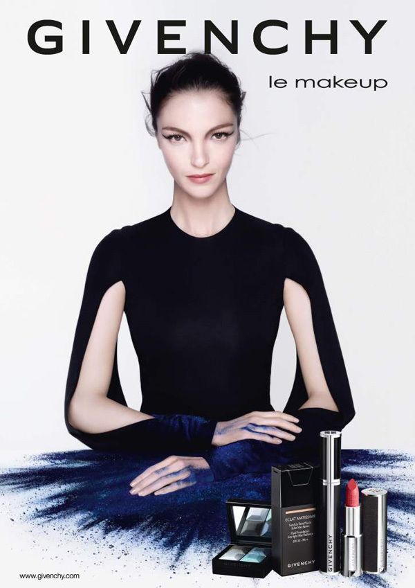
Even their beauty ad campaigns have this cool tinge to them. You can see this dark, moody blue is used again here and this is the colour that has been picked out of this collection to focus on, even though the collection features pastel blues and a bright coral lip colour.
Home (2015) Campaigns. Available at: http://www.thefashionisto.com/filip-hrivnak-simon-miskech-model-givenchy-for-one-cover-shoot/ (Accessed: 23 April 2016).
MagdaLena (2012) Fashion focus: Givenchy nose ring. Available at: https://edelscope.com/2012/05/21/fashion-focus-givenchy-nose-ring/ (Accessed: 23 April 2016).
Estate, S. (no date) Givenchy. Available at: https://in.pinterest.com/pin/313492824033828965/ (Accessed: 23 April 2016).
MODELWERK BLOG (2016) Available at: http://modelwerk1.rssing.com/chan-11916824/all_p14.html (Accessed: 23 April 2016).
explorergram (2016) Givenchy editorials: @lilyaldridge in Givenchy by @riccardotisci17 spring summer 2016 in @wmag | explore instagram online – ExploreGram. Available at: http://exploregram.com/givenchy-editorials-lilyaldridge-in-givenchy-by-riccardotisci17-spring-summer-2016-in-wmag/ (Accessed: 23 April 2016).
Givenchyofficial GIVENCHY (2016) Available at: http://www.alamode.news/user/givenchyofficial (Accessed: 23 April 2016).
(no date) Available at: http://fashionista.com/2014/01/givenchy-spring-2014-ad-campaign-erykah-badu (Accessed: 23 April 2016).
Mariacarla Boscono for Givenchy makeup collection ad campaign (no date) Available at: https://uk.pinterest.com/pin/424253227374315060/ (Accessed: 23 April 2016).
tess (2010) Team Peter Stigter video. Available at: http://www.teampeterstigter.com/paris/givenchy-catwalk-fashion-show-paris-ss2011/ (Accessed: 23 April 2016)
No comments:
Post a Comment