Pages

Wednesday 30 March 2016

Editorial / Setting


 I want my editorial shoot to be shot in a studio, as most of the shoots by Givenchy are. I like the way the studio gives you the freedom to shoot a group of models and can play around with different lighting. The lighting for this shoot needs to be quite harsh and dramatic, something I couldn't achieve in an outdoor or non studio setting due to the amount of light in the surrounding area. Depending on how many models I can find, I may need quite a big studio with both grey, white and possibly black backdrops so I can play around with how the different backgrounds add to my image.

I am thinking of decorating the space, possibly with some chairs draped in lace or leather fabrics to create more of an atmosphere in the studio and add different levels to the image. Props will also help my models pose and could be helpful if any of them are very different in height.

Tuesday 29 March 2016

Editorial / Model Choice

These are some ideas for the sort of looking I am hoping my editorial model to have. As the shoot will most likely been in black and white, I am looking for models with very dark hair as this looks a very striking contrast, particularly for a very monochrome shoot. I would like the models to have bobs ideally, as the hairstyle I am hoping to produce for the look is a sleek, centre parted bob. I'd like to find models with strong facial features and bold eyebrows as these features will stand out in black and white. 

This is the model I used for my editorial test shoot, I have asked her to model for the final shoot and am in the process of looking for my second model. Ideally I would like a mixture of genders and a larger group of models but if this is unachievable will stick to having two female models. I think this model is perfect for a Givenchy editorial, her colouring and facial features are similar to that of the models Givenchy has chosen and she has the perfect hairstyle to explore the centre parted bob trend. 


When choosing a male model, I would ideally like him to have a beard, a good jawline and hair long enough to style in a casual quiffed style. 


This is an image of both of the models I found for my editorial. I think they look really fitting together as they both have dark hair features. The height difference between them is also ideal as Dan is taller but not by so much that it is difficult to take pictures of their faces side by side. I think they fit my initial idea of what I wanted from my models really well and as they already know each other will be easy to shoot as they will feel comfortable and relaxed. 


じゃいレアー (2011) Editorial: GIVENCHY S/S 2011. Available at: https://sdlpunk.wordpress.com/2011/03/26/editorial-givenchy-ss-2011/ (Accessed: 18 March 2016)
coutorture (2009) Coutorture. Available at: http://www.popsugar.com/fashion/Future-Looks-Good-Riccardo-Tisci-Givenchy-6828994 (Accessed: 5 April 2016).
Dobrovicescu, S. (2010) TRAVELLING... WITH A HINT OF FASHION!. Available at: http://www.fashionthroughtravel.com/2012/04/american-in-paris-karlie-kloss-for.html (Accessed: 5 April 2016).
Beautylish (2016) Givenchy. Available at: http://www.beautylish.com/b/givenchy (Accessed: 5 April 2016).

Monday 28 March 2016

Editorial / Test Shoot


These are some images from my initial test shoot for my editorial look. I wasn't very satisfied with how these images turned out, I felt the look was too overly harsh and didn't have the laid back feel that I was aiming for. I wanted the look to feel soft but have a distinct grunge feel to it as all Givenchy's editorial looks have this element, featuring a lot of black and leather. For my actual shoot I'm hoping to have three or four models, both men and women and I am considering shooting in black and white as this is also commonly seen in editorials from the brand. As I wanted the freckles to be a strong focus of the look, I feel they need to be more visible to become a feature. I initially wanted cornrows but found the look far too harsh with both the eye and the lip so I decided to let my models hair down. I preferred this as it brought softness to an otherwise hard look, however I want to feature braids within the editorial so am thinking of a softer braided style I could incorporate. I might go for a nude lip instead of the berry stain as I wanted this look to have 90's influences and this would allow me to add more depth to the eye make up and take it further into the sockets without beginning to look overdone. 

Sunday 27 March 2016

Editorial / Key colours


Pantone 412 U: As white was one of the main colours used for my catwalk designs and my editorial explores the darker, grungier side of the brand, I wanted to oppose this by using black as my main colour. The clothing I choose will all be black in mixed textures such as leather and lace and the images will be shot in black and white too, as this is something Givenchy does frequently. 

Pantone 871 U: I wanted to keep one shade the same between my editorial and catwalk looks. I chose to use gold to accessorise both looks to keep a strong link between them and demonstrate how the colour can appear dark and grungy or light and ethereal. My male model will be wearing Gold hoop earrings and the female will have a gold ear cuff. 

Pantone 732: Brown is the key colour for the make up in my editorial looks. I am going for a 90's grunge inspired feel to the story featuring a dark chocolatey brown lip in one image and a smudged out, lived in eye for the second. The freckles that cover my models face and necks will also be brown in town to compliment their dark hair and pale complexions. 

WordPress (2016) Pantone 732 « Jen Ava. Available at: http://www.jenava.net/blog/?tag=pantone-732 (Accessed: 22 April 2016).
Colors (no date) Available at: https://uk.pinterest.com/pin/326933254174584816/ (Accessed: 22 April 2016).
TAO Colour charts - Pantone - U (2014) Available at: https://uk.pinterest.com/friends4ever/tao-colour-charts-pantone-u/ (Accessed: 22 April 2016).
Edit reference
Edit reference
Edit reference
Edit reference

Trend / Lace

Lace has been used since the 16th century in dress making, although was originally limited to members of the upper class that could afford to pay for it due to its hand made nature. The fabric has always played a key part in the fashion world from the late 16th century when lace collars and ruffles became the desirable style among wealthy women. Machine lace was introduced towards the end of the 18th century, producing lighter fabrics ideal for day wear. Due to it's delicate look and feel, lace has always been seen as a very feminine fabric and white lace in particular has ties to innocence which is why it is often used to create wedding dresses. Black lace used in Victorian funeral attire and for this reason has some dark associations, but in the 21st century can be seen as quite a provocative fabric, as it is now often used to create underwear. This contrast in its nature makes lace a very versatile fabric and one that is frequently celebrated in Givenchy's designs. I love the contrast between the use of white lace and black lace and this is something that I hope to explore through my editorial and catwalk designs. 


Examples of Victorian wedding and funeral gowns, made from lace. 


Examples of the huge range of patterns and styles lace is available in now and how it is used to create lingerie. 


These are examples of Givenchy's use of contrasting monochrome lace, from their Fall 2008 collection. You can see from the two images below how White and Black lace can give completely different effects, from ethereal and goddess-like to morbid and gothic. 


Lace was a trend across multiple catwalks this Spring/Summer, with lace designs also being showcased at Burberry and Zimmerman. 


tanztechno (2015) Underwear. Available at: http://wheretoget.it/look/254455 (Accessed: 23 April 2016).
 Leader, J. (1997) The lace guild - the origins & history of lace. Available at: https://www.laceguild.org/craft/history.html (Accessed: 23 April 2016).
Inspiration: Victorian (2016) Available at: https://uk.pinterest.com/fabricdragon/inspiration-victorian/ (Accessed: 23 April 2016).
Givenchy couture fall 2008 (2009) Available at: http://www.hautfashion.com/designer-collection/givenchy-couture-fall-2008 (Accessed: 23 April 2016).
Armstrong, L. (2015) Burberry fuses the old with the new in slick style. Available at: http://www.telegraph.co.uk/fashion/london-fashion-week/burberry-spring-summer-2016-show-report/ (Accessed: 23 April 2016).
Edit reference

Saturday 26 March 2016

Editorial / Moodboards and Inspiration

This is my mood board for my editorial designs. I have kept the mood board simple and only used black and white tones as my looks will be shot in black and white. I included some brief notes on my initial thoughts about styling, setting and model choice as well as an image of a lace texture than has heavily inspired the styling for this shoot. The images of models I have included have inspired the lighting, make up and model choice of the shoot as I love the finish of these looks. However my images will be more grunge inspired so will include details such as jewellery or embellishments and a more intense freckled make up look. I like the fact these images are shot on a white background but as I want the overall effect of my shoot to be darker, will be shooting mine on a grey background.

Trend / Freckles


 Over the last century, freckles have gone from being seen as an unsightly imperfection, to being seen as a sign of beauty, health and youth. Previously, women had powdered their faces to achieve the pale, even complexion that was so desirable at the time. An even complexion was seen as a sign of class and wealth as working class women couldn't afford cosmetic products. The change in the perception of freckles in the late 20th century could be linked to the growing desire for a tanned complexion and a tan being seen as a sign of health and desirability. Freckles - a skin's natural reaction to the sun often become more apparent when tanned, although many people may have them all year round. They became a symbol of a woman who could live a desirable lifestyle of going on holiday, the luxury of not having to work and relaxing in the sun getting a tan (a complete flip in what was desirable at the beginning of the century). They are now seen as such an attractive, youthful and fresh faced feature that they are constantly being used in fashion editorials, catwalk shows and advertising campaigns, to make a striking statement or a youthful finish. These adverts seen below show the huge change in the perception of freckles over the last century and how they are now being shown in a positive light in advertising.


I think freckles look beautiful when used in editorial shoots as a main feature, as I am planing to do for my editorial. They have the ability to give an otherwise harsh look, a soft, undone and delicate feel making them perfect for the grungy tone of my editorial. I love these examples below, the first two are from an editorial story, I like the way the freckles stay the focus of the look but the make up and hair subtly changes, making the looks flow well together in a story. This is a similar idea to what I am looking to create in my story, but obviously with much more of a grungy influence to fit in with my theme. 


I love the way freckles look when shot in black and white, like my editorial will be. I think it adds contrast between the skin and the freckles, creating a really striking look. I think they would need to be applied heavier when shot in back and white to get the dark and impactful look seen on the right and will need the freckles to cover the entire face, but with a focus on the nose. 


Freckles are also now favoured on the catwalk, seen at Jason Wu, complimenting a matte red lip while Burberry paired them with a pale complexion and deep, vampy lip colour. I love both of these looks, freckles work perfectly to tone down a bold lip turning something that could look heavy into a naturally undone looking make up. 

Name (2011) OH DAMN FRECKLES!!. Available at: https://roundsquarecollective.wordpress.com/2011/04/29/oh-damn-freckles/ (Accessed: 15 April 2016).
Meechan, E. (2014) Editorial: Alice Ma in Chloe Magazine. Available at: https://stylesubject.wordpress.com/2014/05/20/editorial-alice-ma-in-chloe-magazine/ (Accessed: 15 April 2016).
B&W Freckle faces (2016) Available at: https://uk.pinterest.com/acc18/bw-freckle-faces/ (Accessed: 15 April 2016).
Museum, T.M. (2008) ‘A brief history of faux freckles’, Available at: http://www.makeupmuseum.org/home/2013/07/a-brief-history-of-faux-freckles.html (Accessed: 15 April 2016).
Ferrier, M. (2015) Freckles: The new beauty spot. Available at: http://www.theguardian.com/fashion/fashion-blog/2014/aug/08/are-fake-freckles-the-new-fake-tan (Accessed: 15 April 2016).
Ltd, C.N.P. (2016) Berry lips. Available at: http://www.glamourmagazine.co.uk/beauty/beauty-features/2016/1/ss16-beauty-and-makeup-looks-catwalk-trends/viewgallery/1479663 (Accessed: 15 April 2016).
Edit reference
Edit reference

Editorial / Grunge & the 90's Supermodel


The word 'Grunge' is used to describe a movement of music and fashion in the 1980's, with elements of the trend being carried through to 90's fashion. Grunge fashion could also be described as a 'non fashion' due to the un thought through, mismatched choice of pieces, however the looks had a distinct edge. The word grunge was first mentioned in the fashion world in 1992 in womenswear daily, but the trend never made it to the high fashion world due to the mismatched nature of the pieces. However elements of the trend are still seen in street style and the smoky, smudged, lived in make up looks that went alongside have survived and adapted being seen frequently in high end editorials and campaigns. 


This effortlessly stylish look went on to be the foundation of the '90's supermodel' make up look, with brownish earth tones smudged into the socket and a dark nude lip. This look was highly coveted and is now the make up look associated with that era. Stick thin, boyish figures were at the height of fashion and this in combination with the sunken, gaunt, grungy make up seen on the models meant the look was borderline un heathy, but still somehow fashionable. The skin was very natural with development of the tan becoming fashionable making freckles coveted for the first time ever. The whole reason why the look was coveted is because the make up looked so lived in and low maintenance, yet the models still looked carefree and beautiful.


Kate Moss was the absolute poster girl for this look, with her effortless style, party girl persona and smudged smoky, slept in eye make up and natural waved hair. Her turbulent personal life and relationships were splashed all over magazines yet she remained an icon despite her association with drink and drugs.  My editorials will be have a grungy feel to them and the make up I am creating will be heavily inspired by the trends of the 90's and the supermodels of that era. 


This is a make up tutorial I found online for the 90's supermodel look, with the classic deep socket and lined nude lip. However, I want my looks to be less glamorous, messier and more lived in than seen in this tutorial but it is still an interesting take on the trend and gives some useful ideas for products to use and method of application. 


pixiwoo (2014) 90’s super model. Available at: https://www.youtube.com/watch?v=npJnRlbnxMY (Accessed: 24 April 2016).
Edit reference
Price, S.B. (2006) Grunge’s influence on fashion. Available at: http://fashion-history.lovetoknow.com/fashion-history-eras/grunges-influence-fashion (Accessed: 24 April 2016).
Yotka, S. (2015) A decade of Kate: 8 photographers share their favorite ’90s images of Miss Moss. Available at: http://www.vogue.com/13300420/best-90s-kate-moss-photos/ (Accessed: 24 April 2016).
Beauty, P. (no date) Let them stare. Available at: https://uk.pinterest.com/pin/142918988148214817/ (Accessed: 24 April 2016).
Makeover, D. (no date) 90s. Available at: https://uk.pinterest.com/pin/343751384032213508/ (Accessed: 24 April 2016).
Edit reference

Friday 25 March 2016

Editorial / My concept and inspiration


The brief asked us to show the story behind our catwalk looks, through our editorial images. Givenchy has two sides to the brand with the catwalk often being more versatile - anything from the brightly coloured sequin masks of S/S14 to this years softer, more monochromatic and pale lace designs. Yet when looking at Givenchy's previous editorials, they have a very particular style which is often quite dark with grungy influences. My concept for my editorial story is to show the rougher, darker side of my catwalk look, inspired by similar textures and shapes but with a focus on darker colours.

 While the models used in my catwalk look will hopefully be blonde, I want the models for this look to have very dark hair, contrasting to the paleness of their skin. As Givenchy usually use groups of models, I will hopefully have at least two, preferably one male and one female. The two images must flow together like a story so I looked at previous editorials for idea's on how to do this. I would like clothing, models and setting to remain the same across my images, with just a few aspects of the make up changing, as well as the shot of the photograph. The whole 'grungy' look makes me think of the 90's, where brown lips were very fashionable so I have decided to use brown tones as a key colour in these designs. Freckles were seen all over S/S16 catwalks and I love the way they soften and add a natural beauty to an otherwise tough look, so I would like them to be a stand out feature that remains constant across my two designs. 


Design #1: The base will remain the same across both looks, glossy, freckled skin inspired by this seasons 'gym skin' trend (seen at Dior). I want the freckles to be a focal point, covering the whole face with concentration around the nose. The brows will be naturally full and defined complimenting the make up but not dominating. Smudged onto the lids and up into the socket will be a chocolatey brown shadow, creating a slightly sunken effect on the eyes. The shape of this shadow will mirror the slightly rounded, yet slightly winged out shape of my pearl embellishments seen in my catwalk design. The lips will be left almost bare with just a little nude lipstick used to pale them out. Picking up on trends from this season: centre parted hair & bobs and buzzcuts, my female models hair will be a sleek, straight, centre parted bob. 

Design #2: Keeping some elements of the first design such as the base, this design will focus on the lips instead of the eyes. A matte bold lip was seen in shades of berry and red on the catwalks this season, but I want to adapt this to fit my grunge theme by using applying a matte, dark brown shade to my models lips. The eyes will be bare apart from mascara and some vaseline to add a glossy effect, to keep the look from being too overpowering. 

Rogue, F.G. (no date) Givenchy’s fall 2015 collection gets the editorial treatment in vogue Japan. Available at: https://uk.pinterest.com/pin/477381629229897971/ (Accessed: 16 April 2016).
mobil, rental, Bronze, Stuart-Daley, M. and says, B. (2011) Entertainment. Available at: http://www.fashiongonerogue.com/ajak-deng-givenchy-amy-troost-spain/ (Accessed: 16 April 2016).c

Thursday 24 March 2016

Editorial / Previous Editorials


In preparation for planning my Givenchy inspired editorial shoot, I have looked at previous Givenchy editorials for inspiration. 

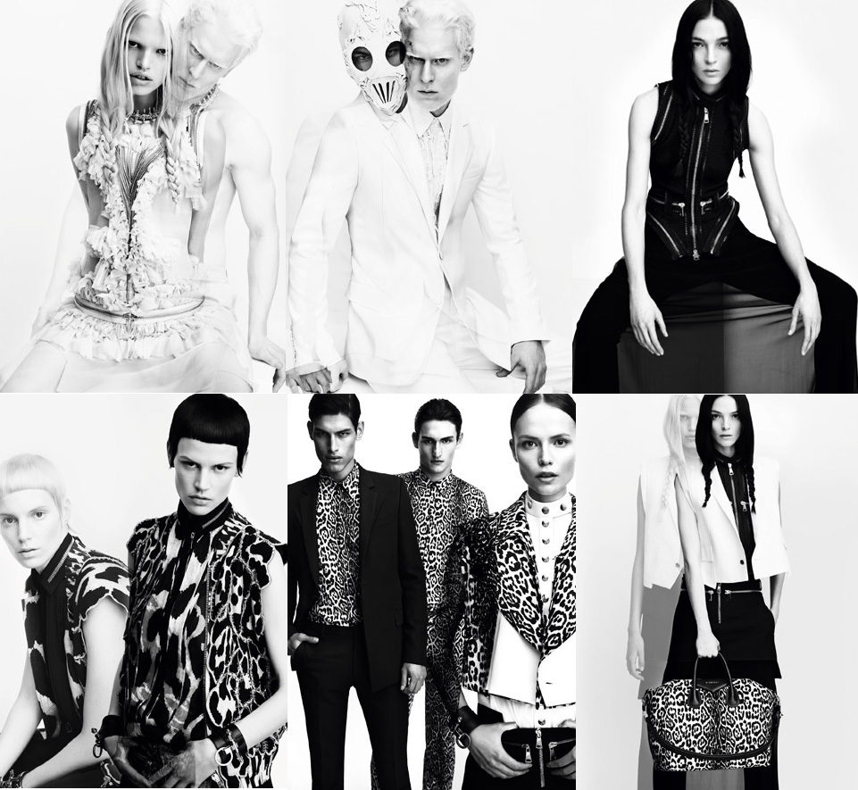
Photography: Most of Givenchy's editorials are shot in black and white which makes the most of the monochromatic styling. The lighting is very harsh and contrasting and shadows are used to make a statement as seen in the bottom right image. 

Setting: Most of the editorials I have found have been shot in a studio, usually on a white or grey background. This allows the photographer more freedom to use the style of dramatic lighting often seen in these shots. However some shots are filmed on location, in which the background is complementary to the styling and mood of the shoot. I am hoping to shoot my editorial in the studio, but use props such as chairs draped in fabrics to achieve a fuller background while still having full control of the lighting. 

Styling: What I noticed is that all the brands editorials have a very grungy feel to them. This is achieved by combining harsh elements such as dark leather and heavy embellishments and contrasting with soft pale fabrics such as white lace. This mixture of monochromatic hard and soft textures is very typical for the brand and can also be seen at their catwalk shows through in Ready to Wear collections. This is something I will keep in mind when shooting my look as the styling of the editorial shoot will be as crucial to the image as the make up. 

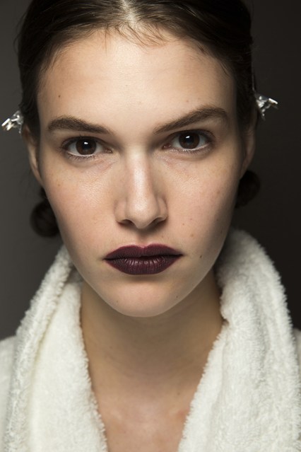
Make up: In keeping with the grungy styling, the make up in previous editorials is often quite smoky and dark. As most of the shots are black and white, the make up needs to be impactful even without colour so focuses on shadows and shapes featuring elements such as statement liner, sunken sockets, bleached brows and facial embellishments. 

Models: Givenchy uses a mixture of both male and female models, often using groups of models posing together. I found when looking in detail at their appearance, that the brand favours either models with very light colouring, or models with very dark hair - both very striking. The models poses are very serious, going along with the harsh theme running throughout these images. 

 じゃいレアー (2011) Editorial: GIVENCHY S/S 2011. Available at: https://sdlpunk.wordpress.com/2011/03/26/editorial-givenchy-ss-2011/ (Accessed: 18 March 2016).
jQuery, F.G.R. and document (2015)Givenchy’s fall 2015 collection gets the editorial treatment in vogue Japan. Available at: http://www.fashiongonerogue.com/gallery/givenchy-fall-2015-collection-editorial-vogue-japan/ (Accessed: 18 March 2016).
StyleCaster (no date) Asian culture. Available at: https://uk.pinterest.com/pin/550776229400736356/ (Accessed: 18 March 2016).
(no date) Available at: http://lookbook.nu/lilianamatthaeus (Accessed: 18 March 2016).

Tuesday 22 March 2016

Advertising / Styling

As advertising shoots are all about promoting the make up, I chose to have both my day and evening models bare shouldered. I did actually do a test shoot for my evening look using a black fur jacket but found it made the look seem really heavy and over done. This also gives me room to add my products in post production without them competing with a busy neckline or necklace. This is something that Givenchy do frequently to keep the attention focused on the make up.


Sunday 20 March 2016

Advertising / Setting & Lighting


When deciding on the setting for my Givenchy adverts, I looked at previous ad campaigns for inspiration. Most of Givenchy's beauty ad campaigns are shot in the studio, as this gives the most freedom to manipulate the lighting or background of the shot in post production. Some however are shot on location, although I noticed this is mostly perfume adverts. I know I want to shoot my daytime look in the studio as I am hoping to edit in a marbled backdrop in post production to mirror what Givenchy created in their actual advert. The studio will give me the freedom to shoot on a white background meaning I can take or find any other image to become the backdrop. I did originally want to shoot my evening advert on location, however as it would need to be shot at night to look like an evening ad campaign and I couldn't find a fashion photographer to collaborate with, I decided against this idea as I'm not yet skilled enough in photography to be confident working out the lighting to shoot outdoors at night time. I am now thinking I will also shoot the evening look in the studio and edit in a background that compliments my daytime look, for example using a dark blue or grey marble in contrast to the pastel one used for the day.

As I want the lighting for my day shoot to be very soft and illuminating, almost as if she is gently glowing, the studio is the perfect place to create this as I have total control over the lighting conditions. I am planning to use the best beauty set up we have been taught in class, using three lights, a beauty dish and two soft boxes. This creates a really beautiful flawless effect on the skin as the light is not too harsh. I am planning on using the same set up for my evening looks however will turn the flash down so the image is slightly darker and the colours look more saturated as in combination with the change of background this will give the look a more evening inspired feel. I will also use reflectors when shooting my looks to ensure there is no darkness under the chin.

Blog, T.B., Reviews, M. and Tips, B. (no date)Cosmetics ads. Available at: https://uk.pinterest.com/pin/36169603234173639/ (Accessed: 24 April 2016).


Элит-Галанд (no date) Givenchy la revelation Originelle spring 2016 collection. Available at: http://elit-galand.ru/kosmetika-vesennie-kollekcii-2016?view=194626803 (Accessed: 24 April 2016).
Edit reference

Saturday 19 March 2016

Advertising / Model Choice

I wanted the models I chose for my day & night looks to have very contrasting colourings and features, to enhance the day/evening effect. As Givenchy typically go for models either with very light or very dark hair, I wanted to stick to this and remain true to the brand. When looking at previous ad campaigns, I also noticed that Givenchy favour girls with good jawlines and perfect heart shaped faces.


The two models that I found fit in really well with this description and I am pleased with how they worked in my campaigns. For my day look, I found Thea Arnott who has beautiful delicate, angelic features and long blonde hair. For the evening I found Eliesse Frost who has a very 'typically Givenchy' look to her with a strong jawline, dark features and a deep chocolate brown bob. I do know both of these girls and another reason for choosing them is that I know they are both comfortable around the camera and are comfortable receiving direction so I know I will be able to get the shots I need which is crucial to the shoot running smoothly.